
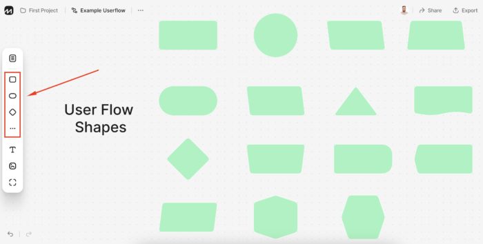
Basic elements
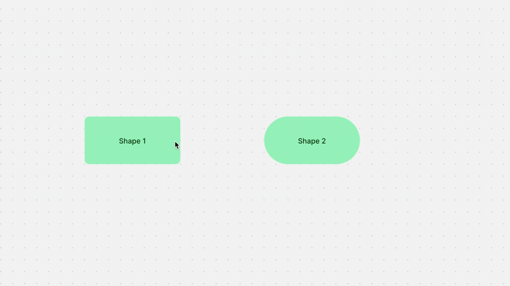
Shapes
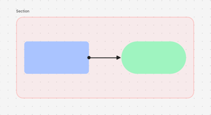
In user flow diagrams, figures or shapes refer to the visual elements used to represent different components or stages of a user’s interaction with a digital product or system. These shapes help create a visual representation of the user’s journey, highlighting the steps they take, the decisions they make, and the outcomes they achieve. Each shape typically carries a specific meaning, aiding in conveying the flow of actions and interactions.
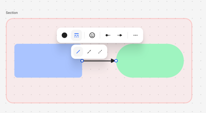
Connectors
Used to connect shapes and indicate the flow of actions. Lines show the user’s movement from one step to another.
To create a line:
- Select an element
- Click on the line start point,
- And drag the cursor to another object at the entry point (the entry/exit points appear when you hover over the object).
Styling a line
Specify arrowheads, icon on line and stroke type and color of the line in the Connection line toolbar.
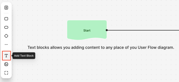
Text Block
Text blocks allows you adding content to any place of you User Flow diagram.
Text blocks helps you with adding explanations, titles, notes, and directions. All this is now possible with the custom text block. All the text blocks are placed relatively on top of each other on the canvas.
We have designed extensive features that allow you customizing the text elements by changing the font, colors, and size, you can fit it into any part of your chart. You can even combine multiple text blcoks with a background block to make them act as single new element.
Text size
There are five size presets:
- Extra small (12px)
- Small (16px)
- Medium (20px)
- Large (32px)
- Extra large (40px)
By default, text is set to Small for all text objects. You can change the size of all the text or a selected portion.
Image
Working with images is an important part when designing a User Flow.
To upload an image:
- Click the image icon on left left toolbar,,
- Select and upload the required image.
- Place the image on the canvas
- Resize it, if you need.
- Set opacity (from 100% to 10%).
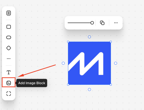
Image files can be uploaded from your computer in JPEG, PNG, SVG, GIF, BMP formats (maximum file size is 10 MB)
Section block
Section block (ex-Background block) allows you combining various elements into the logic blocks.
Easily configure these the parameters:
Background color — allows you customizing the background of the block by selecting the appropriate option from the list: disable background color or set fill color.
Border style. You can choose from one of three border styles: dotted, dashed or solid.
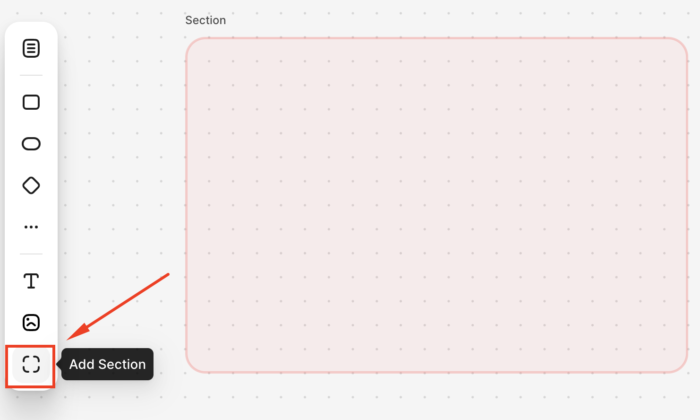
How to put elements into Section block.
- Create a Section block.
- Choose various shape or text block.
- Drag and drop it to the background.
- Resize it, if you need.
- Now you can move the section along with the shapes that were placed on it.
Sitemap page
If you need to add a page from the sitemap or create a new one:
- Click the sitemap page icon in the left toolbar
- In the window that appears, select sitemap and page or create a new one.
Editing the information in the page card is identical to working with the sitemap.
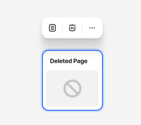
If you will delete added page in sitemap, it will shown like Deleted page
By arranging these shapes and connecting them with lines, user flow diagrams visually communicate the series of actions, decisions, and outcomes that users experience as they interact with a product or system. This visual representation is valuable for understanding, analyzing, and improving the user experience and interaction design.
